Geist
RegularMedium
The product, all of it: titles, body, nav, buttons, forms. On the website, the body and the controls. Never bolder than 500.
- Letter spacing
- −1% body · −3% titles
- Line height
- 150% body · 110% titles
- Weights
- 400 / 500
Warm near-black, one mocha accent, mono for every number.
Mocha is the one accent. Scarcity is what keeps it legible.
One system, two surfaces: serif on the website, Geist in the product.
Cup mark plus wordmark. Mocha is set in Geist, trade in Source Serif italic: one word holds still, the other moves. The mark is steam on dark and ink on light, never mocha, so the accent stays free for action. Don’t redraw the cup; every re-trace drifts, and drift compounds.
Download logo kitThe full lockup is the default signature. Use the cup alone only where type can’t survive: favicons, avatars, app icons, the footer sign-off. SVGs are cropped tight for layout work; PNGs ship with clear space already built in.


Give the lockup a margin of one eighth of the mark height (H/8) on every side. Inside that zone, no type, rules, or imagery. Crowding reads as noise. Below minimum size the steam lines close up: switch to the mark instead of shrinking the wordmark further.
Wordmark min · 96 pxMark min · 16 pxWhere the lockup lives today. On the website it opens the floating nav island at 28px tall. In the product it opens the 56px app bar at 22px, with the section pill beside it. The cup alone signs the footer and every icon slot.
Request accessHomeMarketTradePortfolioThe test is simple: if a treatment changes the silhouette or the colour story, it’s out. The mark carries the brand only while it stays exact: steam on dark, ink on light, nothing else.
Four faces, four jobs. Geist runs the product, titles included, at 400 and 500 and nothing heavier. Geist Mono holds every number. Source Serif 4 is the website’s headline voice and the italic in the wordmark. Geist Pixel, dotted, marks the system at label size. The pairing works only while each face keeps its lane; the product uses the first two only.
Weight, kerning, and leading are paired with the face. Treat each card as one locked setting, not a menu. If a face feels wrong at its settings, the face is wrong for the job.
The product, all of it: titles, body, nav, buttons, forms. On the website, the body and the controls. Never bolder than 500.
Every number, price, percentage, size, timestamp, ticker and code. Tabular figures, so columns never wobble while numbers move. Also the 11px uppercase eyebrow.
Website headlines and pull quotes, with the italic carrying the emphasis inside a line. The trade in the wordmark. Never in the product, never for UI.
Indexes, kickers, tickers and status marks on the website and in print. Label size only: it marks the system, it never speaks for it. Not used inside the product.
The scale is the hierarchy: when something needs more emphasis, change the level, not the face. The product has no display sizes on data screens; one 20px figure per panel is the ceiling, and the portfolio value at 24px is the one exception.
Trade US stocks from India, in rupees.
Portfolio value
Money added is yours to withdraw any time. No lock-in.
Available to trade
₹4,07,939 · $212.48
Live · 15 Sept · IST
Open · 02 Type
Every number, price, percentage, size, timestamp, ticker and code is mono with tabular digits. Mono is for figures, never for phrases: a caption of three or more words is set in Geist with only the figure inside it in mono. A whole line of mono words reads as a terminal dump.
Keep product titles in Geist and prices in Mono. Source Serif is for the website, never a control or a product heading. Uppercase only at caption size, 12px or smaller. Nothing bolder than 500. And never mix all three faces in one component; three voices in one card is already an argument.
Think rhythm, not rainbow. Warm neutrals first, mocha once; feedback for forms, direction for money, signals for charts. Values are locked: don’t interpolate new greys or invent a second accent. Restraint is the mechanism. The accent means something because it is rare.
The one accent: a single action, a selected state, a focus ring, the crosshair on a chart. Never the page fill, never a series colour. Mocha lite is the type that sits on mocha. The muted wash is as far as mocha spreads on a surface. Click to copy.
Nothing we ship is black and nothing is grey-neutral. The website sits on a deep warm black so the artwork has room to glow. The product sits on a warm dark grey, never black, so panels one step lighter read as elevation with a hairline you barely see. Sign-in has its own canvas between the two.
The default palette. Everything in the terminal, portfolio, funds and settings is built from these tokens and nothing else; the code forbids raw hex. Click a field to copy.
Start here. Page is the canvas. Text is body and the primary button fill. Mocha is the one action that isn’t neutral.
Panel sits one step above the page. Hover is the lift, Selected the soft pill on the current nav item. Field is the input fill. Hairline is every border and rule. Panels never nest inside panels.
Text for body and values. Secondary for supporting copy. Dim for labels and captions. Faint for placeholders and disabled, never for copy someone has to read.
The shared neutrals the ink steps come from. Stay on the ramp instead of mixing a new grey: eight steps everyone shares beat a hundred greys nobody can name.
The split sign-in page: content column on the auth canvas, image panel at the left. A shade lighter than the terminal, a shade darker than the panel. The terminal never shows behind these screens.
mochatrade.com. The same ink and accent on a deeper ground, with the elevated tone for the nav island and cards. This is also the chrome you are reading now.
Deep warm black. Hairlines are drawn at 5 to 10% of the text colour so the grid reads as rails, not boxes.
Elevated is the nav island and any card that needs a surface. Hover is one step up. Input is the email field on the footer and the request form.
Three sets that must never blur. Direction is the money moving. Feedback is the interface talking. Signals are the chart’s vocabulary. A loss must never look like an error.
Up, positive, buy, long: sage. Down, negative, sell, short: clay. Muted, for numbers and thin bars. Never colour alone: a triangle, sign or word travels with every reading. The only solid fills are the order button and the 24h move chip on Market.
Forms, toasts, banners, wells. Pair the solid with its well; the well is the fill, the solid is the icon or the line. Danger is validation and destructive, not P&L.
Series take colours in this order: sky, clay, gold, rose, lime, tan. Sage is direction only. Never a button, never the brand: the moment a signal becomes a control, the chart loses its language.
Nothing we ship is light. This remap exists for decks, print, press placements and partner surfaces: near-white canvas, near-black type, the same accent. Nothing new is invented on the way over.
Same three roles.
Cards sit on Elevated. Hover is the lift. Muted is secondary type.
Border at rest, Input the field fill, Pressed the down state. Selected and Accent muted are thin mocha washes. Focus and hover are mocha.
Pair each solid with its light well.
Four ways the palette breaks. Each one looks fine in isolation; each one spends the accent’s scarcity or the chart’s vocabulary, and neither comes back cheap.
The terminal register. Small, even type on a warm grey page; panels one step lighter with a hairline you barely see, so elevation reads as tone, not outline. Indian retail traders taking leveraged positions on US stocks need, in this order: where their money stands, what changed, what they can do next. Everything below is drawn with the product tokens.
Page, then panel, then a row. Whitespace lives between panels; rows inside a panel stay dense and are cut by hairlines. Panels never nest inside panels, and a border is never used to repair weak hierarchy. Radii: 8px for panels, 6px for rows and chips, 12px for the auth fields. No shadows, no glass.
Reference: Perplexity Finance. Labels and body 14px, numbers 13px mono, section labels 16px, at most one 20px figure per panel. No display sizes on data screens. Sections breathe; rows don’t.
| App bar | 56 px | sticky; anything else that pins starts at 80px |
|---|---|---|
| Rail row | 56 px | logo, name, symbol · price and change right |
| Market row | 52 px | sortable, trend chart per row |
| List row | 48 px | settings, positions, activity |
| Dense table row | 44 px | history, holdings |
| Terminal row | 40 px | positions panel, book, fills |
| Tab row | 36 px | underline tabs inside a panel |
| Panel padding | 16 px | section gap 36 · label to panel 12 |
| Frame | 1400 px | main column plus a 360px rail; terminal min 1280 |
Every button has visible hover, focus (2px mocha ring, offset), active, disabled (45% opacity) and loading (spinner replaces the icon, width held). A control with only a resting state is not finished. Primary is filled text on the page; the order button is the one solid sage or clay fill in the product, and it reads back exactly what will be sent.
One form for every rupee change that sits beside its percent: filled triangle, unsigned amount, percent in brackets, then the period word. The form brokers print. One name for the total, everywhere: Portfolio value. Margin and liquidation are shown as a distance plus a bar, never a bare number.
A status is a dot plus a word. It gets a fill only when it must be noticed: the 24px tag in a well. Healthy sits in the success well, Watch in warning, At risk in danger with a slow ping. Notices are one line, 12px, dim, with a leading icon; never a boxed paragraph. If a notice implies something the user could do, make that an action instead.
Smooth monotone curves over the candle grain, a fade from the line colour to nothing beneath (the one gradient allowed anywhere: it is data ink, not decoration), a dashed reference at the previous close, a soft halo on the live end. The crosshair is mocha, the single highlight on a chart, and its readout carries the IST time. Series take the signal colours in order.
Mochatrade is capable, welcoming, and lightly playful. The warmth stays consistent; the playfulness changes with the situation.
This guide defines how Mochatrade sounds across its website, product, onboarding, announcements, marketing, community, customer support, and AI assistant, Beans. It is for everyone writing on behalf of Mochatrade, including AI agents.
Always write Mochatrade in full, as one word with a capital M. Never shorten the brand to “Mocha,” including in greetings or community references.
| What we are naming | Use |
|---|---|
| The brand and platform | Mochatrade |
| An individual customer | Mochatrader |
| Customers collectively | Mochatraders |
| The broader community | The Mochatrade community |
| Our AI assistant | Beans |
Mochatrader and Mochatraders are the approved customer names; write them as single words.
Use the customer name naturally in welcomes, campaigns, community stories, and announcements. In a support conversation, usually address the person by their name or as “you.” Repeating “Mochatrader” in every message feels forced.
The identity we express is curiosity about global markets, independent judgment, and appreciation for clear information. Belonging does not depend on trading frequently, taking bigger risks, or making profits.
We respect the customer’s intelligence, make information easy to understand, and help them take the next step. Our personality comes through in familiar language, thoughtful details, and a little coffee-inspired wit.
Get to the useful information quickly. Be specific about the product, the question, and the next step. Confidence comes from understanding the details and being honest about what is known.
Make it easy to ask a question. Use everyday words, natural contractions, and a respectful, conversational tone. Explain unfamiliar mechanics without assuming the customer is new to trading.
Bring warmth, wit, and coffee wordplay to suitable moments. Personality should make the message memorable while keeping its meaning clear. As the stakes rise, give more space to precision and care.
Our voice stays recognizable across channels. Tone follows what the customer is experiencing.
| Situation | Tone | What the message should do |
|---|---|---|
| Marketing and community | Warm, inviting, playful | Create interest and belonging; give a concrete reason to care. |
| Onboarding | Welcoming, encouraging, clear | Confirm where the customer is and make the next step easy. |
| Feature announcements | Informative, conversational, a little expressive | Explain what is new, why it helps, and how to use it. |
| Routine support | Calm, helpful, direct | Answer the question and help the customer move forward. |
| Complaints and money issues | Attentive, composed, precise | Acknowledge the issue, explain verified facts, and give the real next step. |
| Incidents and service updates | Plain, accountable, specific | State the impact, what is known, and the next confirmed update. |
| Beans in everyday conversation | Personal, natural, quietly capable | Use the conversation’s context and give useful help with minimal friction. |
A social reply about a missing withdrawal takes the tone of support. A feature announcement can be lighthearted; an incident announcement needs calm precision. Match the person’s situation before matching the channel’s usual style.
Where coffee wordplay fits, and how to structure an announcement.
Coffee puns are part of our marketing voice. “Brewing,” “freshly added,” and similar language can make campaigns and welcomes feel distinctly Mochatrade. Choose the phrase because it fits the message; coffee wordplay does not need to appear in every piece of copy.
“Your Mochatrade access is brewing” works because it connects a familiar coffee expression to the wait for access. Follow it with a clear explanation of what happens next.
Invite participation and express a shared outlook. Use Mochatraders when speaking to the community. Focus enthusiasm on the product, discovery, learning, and belonging. Avoid pressuring people to trade, deposit, or take more risk to feel included.
Use light wit about everyday friction, such as scattered watchlists or confusing interfaces. Keep coffee metaphors out of communication about delayed money, losses, liquidation, and incidents.
Use a simple sequence: what is new, what it helps with, and what to do next.
The opening can carry personality, but the feature and benefit should be clear after one quick read. “Freshly added: watchlists” names the feature immediately. Follow with a concrete benefit and an accurate next step.
For funding, company milestones, and other announcements, lead with the actual news. Use specific facts and a clear reason it matters to the audience. Keep excitement proportionate to the announcement.
Beans is your personal AI assistant on Mochatrade: warm, familiar, quick, and quietly capable.
Talking to Beans should feel like casually messaging an assistant who follows what you are trying to do. It uses the context available, asks for what is missing, and helps you move forward. Its personality comes through in attentive, useful conversation.
Keep the personal tone, with more care and precision. Acknowledge the specific frustration briefly. Explain what is known, what is uncertain, and what happens next. Avoid long stock apologies or automatic reassurance.
“I checked,” “I’ve sent this for review,” and “I’ll update you” must correspond to real checks, completed actions, and supported follow-up arrangements. Never invent account context or imply that Beans remembers something it cannot access.
When human help is needed, use the available handoff process. Include relevant conversation details where supported and tell the customer what actually happened.
| Situation | Beans can say |
|---|---|
| Introduction | “Hey, I’m Beans, your AI assistant on Mochatrade. What can I help with?” |
| A customer thanks Beans | “Anytime.” |
| A customer repeats details Beans can already access | “You’re right, I have them here. You don’t need to send them again.” |
| A support handoff and transfer of details have succeeded | “I’ve passed this to the team with the details you’ve shared.” |
How every message is built, kept accurate, and phrased.
Simplify the explanation while preserving the meaning. Keep product terms and material qualifications accurate. Describe the actual instrument and feature; do not turn a contract into a claim of share ownership or an example into a live product promise.
Verify account and transaction details before stating them. Never invent a cause, investigation, escalation, refund, guarantee of safety, or completion time. Reassure through accurate information and useful action.
| Avoid as a default | Use when the facts support it |
|---|---|
| “We are delighted to announce the introduction of…” | “Freshly added: watchlists.” |
| “Dear valued customer” | The customer’s name, “Hi,” or a direct answer. |
| “Kindly be informed that your request has been escalated.” | “I’ve sent this to the team for review.” |
| “Don’t worry, your money is completely safe.” | A verified status, what is still unknown, and the real next step. |
| “Great question!” before every answer | The answer itself. |
| “Happy brewing!” after a withdrawal complaint | A clear status and follow-up, where available. |
These examples demonstrate voice and tone. They do not establish product availability, account status, service processes, or promises. Use an example only when its stated conditions are true, and replace bracketed fields with confirmed information.
Use when signup is confirmed and email notification is the actual access process.
Your Mochatrade access is brewing.
You’re on the list. We’ll email you when your access is ready.
Use when access has been granted and account setup is the next step.
You’re in. Welcome to Mochatrade. Let’s get your account set up.
Illustrative watchlist launch. Use only when the feature and action exist.
Freshly added: watchlists.
Keep the markets you follow in one place, ready for your next visit.
Create your watchlist.
An invitation to share an interest in markets.
Mochatraders, what’s brewing on your watchlist?
Tell us which market has your attention this week.
For a watchlist that only saves a market, when the customer asks whether adding it places a trade.
Nope, that just saves the market for later. It won’t place a trade or move your money.
Use when the customer has had to follow up, pending status is verified, a review has been submitted, and a specific follow-up is supported. The completion time is unknown.
I’m sorry you’ve had to chase this. Your withdrawal is still pending, and I don’t have a confirmed completion time yet. I’ve sent it for review and will update you by [confirmed time and timezone], even if there’s no change.
Use only confirmed impact, work, and update details. If a restoration time is known, state it accurately; otherwise, keep the uncertainty explicit.
[Affected service] is currently [verified impact]. [What the team is actually doing]. We don’t have a confirmed restoration time yet. Our next update is due by [confirmed time and timezone].
Seven checks for every message before it goes out.
The system on real screens: the product prototype and mochatrade.com at 1440 wide. Words alone make every reader rebuild the style differently; shipped examples are what make work converge.
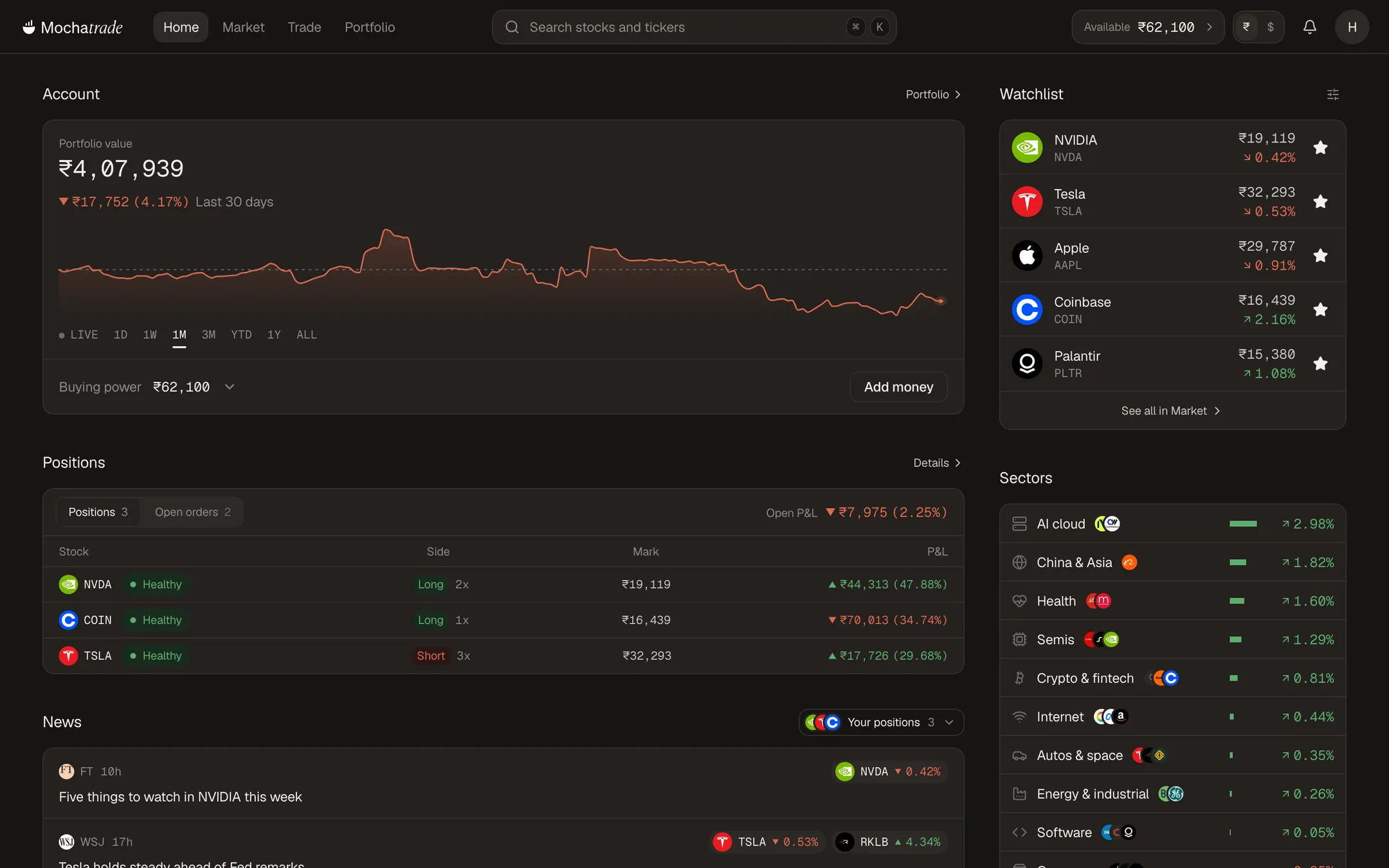
Geist and Geist Mono only. The portfolio value at 24px with the change beneath it in the broker form. Sage and clay for direction, never colour alone. Mocha only on the one action.

Source Serif 4 with the italic carrying the emphasis. The nav island sits on the elevated tone and the one mocha button is Request access. The globe of live fills is data as ink, in mono.
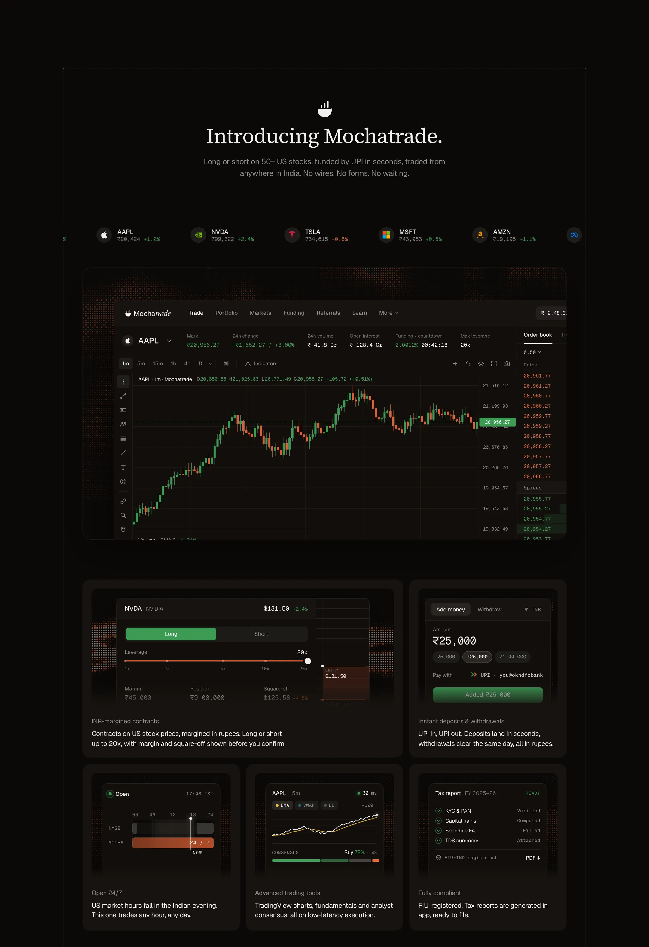
The terminal appears in its own palette, never as a mockup of something else. Five cards each carry one product truth in Geist body copy under a serif heading.